
Building a weather station for the economy, because I needed one

A few years ago, I watched a thirty-minute video that changed the way I saw the world economy forever.
Ray Dalio’s How the Economic Machine Works fascinated me so much because it explained the whole thing as a machine: credit, spending, income, productivity, cycles running at different speeds, parts that interact with each other in ways you can understand and model. Before, economics seemed like a mystery to me, only measurable through statistics that looked more like random squiggles than methodical science. After watching it, I started seeing the world economy as a mechanism that is complex but not mysterious: something you can understand from first principles.
This is exactly the kind of explanation I’ve been looking for during my whole career, in anything: if you spend enough years looking at distributed systems, organizations and supply chains, at some point everything starts to look like a system, which is more or less the lens I keep coming back to, and one of the reasons I keep recommending Donella Meadows’ Thinking in Systems to anyone who’ll listen. It’s also expert-generalism applied to economics.
So for the first time, the macro part of investing stopped being something mysterious, and started being something I could understand and take into account when making investment decisions.
Knowing how weather works isn’t the same as looking outside
A mechanistic model is great, but in this case, it works across years, if not decades of economic trends. This means you need some way of knowing what the current economic weather is, so you can think about where we are, and what it means to your investing strategy.
So I needed a current picture of economic conditions, built from public data, with a reproducible way of understanding how the numbers are created, from raw series to final graphs on the screen. Like a thermometer or a weather station telling you the current weather conditions out there.
“Why is he writing about the economy now?” you may ask. I’ve been managing my own investment portfolio for over a decade now, trying to develop this as a side-competency of mine. I’ve just never written about this here because it’s not quite part of German culture to talk about personal finance, and there are already many, many personal finance blogs out there. Just no Dalio-style economic weather stations that I know of.
Earlier this year I wrote about the shift from scarce code to abundant builders, and how I built my own video background generator rather than paying €60 for a tool. Same thing here: building it on your own not just gives you more control, it also enables you to understand it from the ground up. (Even if Claude Code did all the actual coding.)
So, here’s my Economic Compass.
How it works
For an investor, two things about Ray Dalio’s economic machine matter most: growth and inflation. If growth goes up, stocks tend to go up. If inflation goes up, gold tends to be more interesting to investors. If growth goes down, investors tend to flee into bonds instead of stocks. And so on.
Since the market tends to price in expectations, I’m not interested in current growth or current inflation. Instead, I want to know how far current conditions sit from their own normal. In weather terms: is temperature falling faster than expected? Is there more wind than usual? This results in two axes on the economic compass: growth momentum on one, inflation momentum on the other. Each is measured against its own long-run past, so the question is never “is inflation high” in the abstract, but “is this series running hotter or cooler than its own normal, and which way is it moving right now?”
Like any good analyst, I plotted the two numbers against each other, creating a simple and easy-to-read chart with four quadrants: if growth accelerates together with inflation, we’re living in a totally different world than one in which growth slows down while inflation accelerates. You can hold those four possible worlds in your head in a way that makes more intuitive sense than staring at forty economic indicators. Dalio’s machine has many moving parts, but for the single question “what kind of weather is it”, these two axes tell a surprisingly useful story.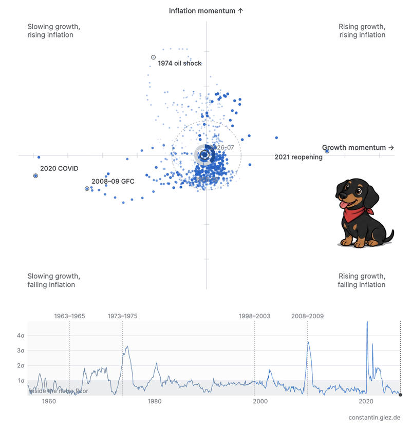
For people who want more details, there are eight gauges with more detailed data, and a table showing the data series and their contributions to where the dots landed. The data comes from public sources, refreshes itself weekly, and lands in a static JSON file that anybody can fetch, and which the page uses to draw its graphs from.
Each series is measured against its own recent history, weighted towards the most recent decade. This means that a genuinely slow structural shift gets gradually absorbed into what counts as normal, and the compass would report it as unremarkable. In other words: the compass is sensitive to sub-decade weather changes, but it is fairly blind to larger climate changes. Dalio’s research spans centuries, while the data I was able to find goes back about seventy years.
Should you trust a random hobbyist’s macro indicator? No, you shouldn’t! That’s exactly why I built my own instead of trusting somebody else’s. Now I know much more about economic data sources, their licensing, lineage, and statistical challenges, as well as what’s not (yet) reflected in the compass. I did include some explanation and source links for you to check. Feel free to let me know if you have ideas or find any issues.
What would Tufte do?
I’m interested in many things and learned some over time, but I’m not a data visualization expert.
The default approach would have been to do what everybody else does: line charts, bar charts, maybe a pie, that’s it. It would have been boring, and nobody likes boring. Instead, I wanted something I can intuitively understand.
So I asked Claude what Edward Tufte, one of the leading authorities on modern data visualization, would do with this data: given what this data actually means, what’s the right way to carry that meaning to a reader?
Through many iterations, Claude Code and I arrived at dots, plotted on the 2D growth/inflation quadrant chart, where each dot’s size and saturation indicate its age, while the newest dot also carries a ring that tells the viewer how complete the data is for that last observation (there are many data series flowing into each dot from many sources, each one arriving at different times and updated at different intervals).
Most of the time, nothing exciting really happens. Statistically speaking, these are changes within a one-sigma range, which is painted in as a dotted circle: if a dot is in there, it’s business as usual in world-economic terms. Roughly seven out of every ten months since 1955 sat inside the one-sigma circle. Only if the dots are outside the circle should we pay more attention: it means that something interesting is happening in the world economy, and we should take a look. Also, the dots don’t carry any time information, so I added a timeline at the bottom with combined momentum that you can scrub through to learn how the dot history unfolded.
This is a classic case of inviting your heroes into your AI conversations: by invoking virtual Tufte through Claude, I was able to find and build a much better visualization than anything I could have come up with on my own. And on top of that, I now understand why each choice was made. That’s something I can take with me into whatever I build next.
Not done yet
This compass has been quite a discovery journey for about two weeks now, with many twists and turns as Claude Code and I explored data sources, their licenses, the quirks of incomplete data, visualization options, page copy, how to handle missing data, GDP weightings, and many other, bigger and smaller issues. We changed direction multiple times and we both learned a lot during this process (we keep a LEARNINGS.md file for Claude to refer to). I expect this to continue moving, as I explore this further. However, the page is self-documenting so whenever it changes, you’ll find the current sources and explanations on the same page. I hope it’s useful to you, too!
Where to learn more
If you’d like to dive deeper, Dalio’s How the Economic Machine Works is thirty entertaining minutes well spent, and his books go into great detail on his research spanning many centuries of economic history. For systems thinking in general, check out Donella Meadows’ Thinking in Systems. And for a different, yet similarly mechanistic view of the same territory, I’d recommend Mark Spitznagel’s The Dao of Capital, which argues with Dalio’s view in productive and thoughtful ways.
This is a bit of an experiment: I’m not sure whether this is interesting to you or not, so if you’d like more of my thinking on economics and finance topics, tell me!
The Economic Compass is a diagnostic instrument built from public data. It is not a forecast, and nothing here is investment advice. The composite draws on Ray Dalio’s public writing on economic machine cycles; the implementation is my own, and is not affiliated with or endorsed by Ray Dalio or Bridgewater. Data sources, their as-of dates and their attribution requirements are listed on the compass page itself.